 |  |  |
|---|---|---|
 |  |  |
 |  |  |
MILLER LITE REBRAND
Situation:
Miller Lite was becoming out of touch with younger drinkers. Most people had forgotten they invented light beer. Plus, it looked like a brand for people 45+ years old, even though the liquid was exactly what younger drinkers wanted.
Brief:
Create an identity so bold it could not be mistaken, yet malleable enough that it could be kept fresh enough to be noticed by todays cord-cutting, YouTubing, Snapchatting, bar hopping, C-store shopping, brand promiscuous, beer drinkers.
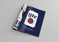
Solution:
Miller Lite is re-released its original white can as the first step at being an original. Younger drinkers (21yrs+) took notice so we visually condensed the reissued packaging into the Minimalist Can icon. It became the core of the new visual ID. This new Minimalist Can icon is bold, medium neutral, and constantly evolving. It allows us to say more with less words.
Results:
The Miller Lite brand has reversed years of negative momentum and is growing again. Since the launch of the new visual identity in early 2016, Miller Lite has been on a streak of back-to-back quarterly share growth (12 consecutive quarters so far) against Bud Light, a longtime nemesis and market leader. In fact, Miller Lite is on the verge of surpassing Budweiser as the number three beer brand in America. Support is up with distributors and cultural partners, who have completely embraced this new approach. More importantly, they've seen similar improved penetration with young drinkers and specifically Latino drinkers.
Awards:
- Cannes Lion - Bronze - Rebrand / Refresh of an existing brand: Consumer
- London International Awards - Silver - Design Brand Identity
- Applied Arts - Winner - Entire Design Program Campaign