 |  |  |
|---|---|---|
 |  |  |
MILLER LITE DESIGN CANS
Situation:
Miller Lite was becoming out of touch with younger drinkers. The brand be came known as 'your dad's beer'. We needed to come up with a new visual langauge that spoke to a younger generation without alienating our current drinks.
Brief:
Remind our younger beer drinkers (21yrs+) that we are the Original Lite Beer. Modernize the brand without losing the timeless core and become once again relevant to younger 21+ year old drinkers.
Solution:
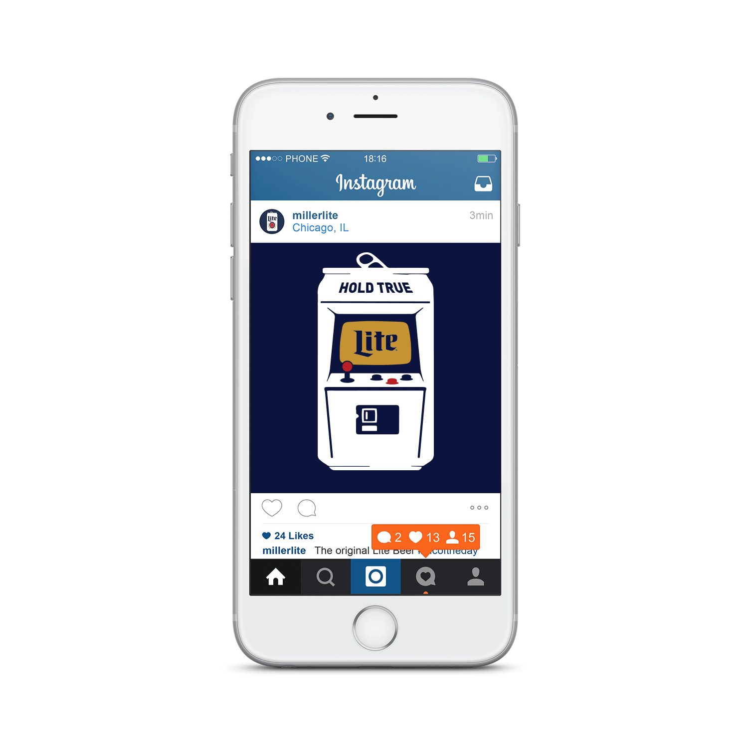
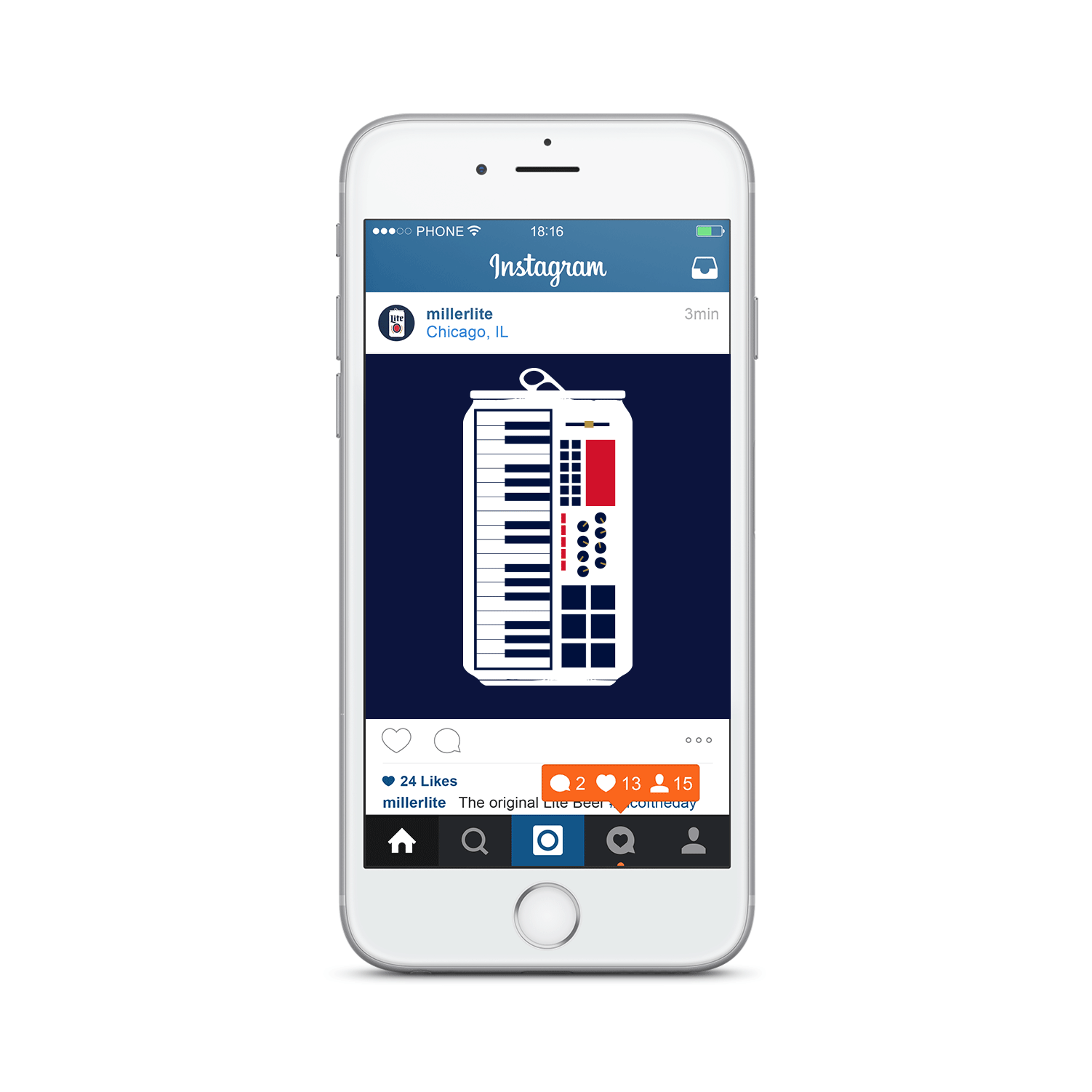
Miller Lite is the original lite beer and recently released the original white can. Younger drinkers (21yrs+) took notice so we visually condensed the reissued can into the Minimalist Can icon. Inside each can illustration we embedded another ‘original’ that went perfectly with a Miller Lite.
Results:
The Miller Lite brand has reversed years of negative momentum and is growing again. Since the launch of the new visual identity in early 2016, Miller Lite has been on a streak of back-to-back quarterly share growth against Bud Light, a longtime nemesis and market leader. Support is up with distributors and cultural partners, who have completely embraced this new approach. More importantly, they've seen similar improved penetration with young drinkers and specifically Latino drinkers.
Awards:
- Applied Arts - Winner - Poster Series
- Applied Arts - Winner - Promotional Apparel Single (Cassette)
- Applied Arts - Winner - Promotional Apparel Single (Ace)
- Applied Arts - Winner - Promotional Apparel Single (Arcade)
- ADCC - Silver - Advertising Posters
- ADCC - Silver - Poster Campaign
- ADCC - Merit - Poster Single